Collaboration
- MDM620: Design Integration (Feedback 1-3/ Weeks 1, 2 and 3) Adam Baldowski - Mastery Journal Posts:
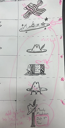
This week was the first week for the whole entire thesis project in itself. A visual for Mandy Madison was in the starting stages, however a logo was primarily the motive to set things snowballing. Needing to understand what designs went where was the first big step. Making sure everything flowed together in unison as well as making weird designs to toy around with. Next week the designed images went under a much larger change, being refined and creating different versions of said refined logos made things easier for Madison to pick. These two logos were the chosen ones in her own eyes, following her back routes of growing up on backside country roads, mainly dirt surrounded by trees. Enjoying times with her friends and drinking beer in the back of pickup trucks, however the same goes for her dreams.
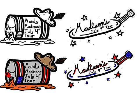
Wanting to be a big star, and beyond the young lady she was back then her second logo was made in the sense of a pop singer with country attributes included. These steps were taken to get to this point however, and all designs turned towards a final six contenders. These designs resulted in a much more refined product using design 2.5 and design 4.5 as the main two. However, aspects from designs 1,3,5,6 were implicated in the final two designs. As much of the feedback given from Mr. Baldowski was attempted to be used in the remaining designs. “Explain what is simple. Avoid the word simplistic as it has negative connotations. What about the design is appealing and how do you know? How does the design accurately identify the artist as a country singer?” These questions that were asked by Baldowski play a role in the final two logo designs. Resulting in a much more country vibe as well as implicating what Madison loved the most being her roots. Beer’s in the back of a pickup, patriotism and of course feeling like the number one country singer she means to be. Those comments resulted in these final logos which still brought up questions that ended up being disregarded. How is this country? What makes this country music related? Why do her roots have to involve alcohol? These were disregarded due to the fact that this is Madison’s back story, how she was raised, and what made her to be the woman and star she is today. Madison and the designer both agreed that no change was necessary because of her personal decisions. Because of this the original logo mockups stayed the same and nothing was needed to change overall.
- MDM620: Design Integration (Feedback 4/ Week 4) Adam Baldowski - Mastery Journal Posts:
“The guide is showing different logos, but I do not see each of the sections presented as instructed. For example, why are you using two different logos?” This is the main question that resonated deeply for Madison, but no real change was truly needed. Madison wanted two logos, she looks at Zach Bryan for example, using his actual name as a logo and an image for an in concert logo. Both of these logos being different creates the idea that she is not able to decide on what she fully wants. However as the designer and creating Madison’s logo, everything seems to be perfect in her eyes. As said above as well, the logos that Madison wanted and had dreamt up were created. They just needed some tweaking which resulted in the two final logos. The vision board creates a sense of what the concert will feel like, as well as the color coordination to funnel perfectly with the stage as well as her own personal design measures.

- MDM650: Multi-Platform Delivery (Feedback 5-6/ Week 1, and 2) Andrea Kratz - Mastery Journal Posts:
“The requested Sketches were meant to be a think-through of how to apply the brand design and styling across the six media pieces being produced this month. They should not have been more alternates of just the logo...The requested Production Plan was meant to map-out the Project creation process for making the six media pieces in this month's time frame, accommodating your own life factors. It should not have been a publicity and client presentation plan as shown here.” This was the feedback that was received, and nothing was done about it. Nothing was done because growing a brand starts with a logo and a plan. If people like the logo then why change something that is not broken. The instructions were misunderstood in the long run being the whole entire plan should not have been formed yet. Rather than taking every week to figure out what needed to be done, Madison already had it planned out. Then it was just a time stretch of making sure everything worked out together and sounded good. Everything will be running as smoothly as possible, it is a first time tour and things are meant to fail. If they do fail as well, the back up plan is to create more images and logos, using A/B testing in this scenario to find a solution. Madison debating with the overall design team will bring in a much larger understanding for everything to run as smoothly as possible (Bruton 2022, Par 2-3).
“By combining both qualitative and quantitative measures, companies can get a clear idea of the ROI they're getting from their graphics investments. It's important to note that graphics that don't generate sales or other measurable results can still be valuable” (Estaura 2023, Par 3). Tracking actual numbers from branding or the graphic design attributes is not always a sure fire way to figure out how things sales will increase. On the contrary, the time spent on a site may have something to do with the logo, but that is always a possibility and not a statistic that is concrete. Visual communication, Brand Recognition Increased Traffic which turns into an Improved User Experience will create more recognition for the brand itself and will create a more positive ROI all around. There are many types of graphic design but in this sense Logo Design is the priority for this specific feedback. Being more strategic than anything, logos will come to terms that it is the thing that creates the look and overall feel for the whole entire brand (Estaura 2023, Par 6-9).
In Madison’s case, the two brand logos each serve their own purpose in their own forms to create a better return on investment strategy. Figuring out the ROI for each item sold and how planning can change if something comes up. Family matters and in general just apparel all around can change, however that has not been looked upon yet until it happens. Madison is more of a last minute person and always has been, figuring things out as she goes and trying her absolute hardest. No matter what she will make sure things are done right, and if they are not she will fix them. That goes for all things in her tour from merchandise to the nitty gritty stuff involving sound, how the stage is presented, etc.

“Brand Vision Board: as discussed previously, it is important, to your overall brand story, to make sure this brand look & feel starting point is made compatible with the evolution of the brand thinking.” Shown above as well the vision board is meant mainly for certain attributes to be set and stone. Overall Madison has a general idea for where she is going, however the execution is what really matters. Executing this will mean everything goes according to plan for her, the stage is set the way she wants it to be, her fans are loving the concert as a whole, and merchandise is selling. As said before, again, she will need to account for things not being perfect as for she is just a human who makes mistakes as well. Overall this will result in more success over time and a better outcome for Madison as a whole. “Q: What should I put on my vision board?A: Anything that inspires and motivates you. The purpose of your vision board is to bring everything on it to life. First,
think about what your goals are in the following areas: relationships, career and finances, home, travel, personal growth (including spirituality, social life, education) and health.You don't have to cover each area exactly the same, just take a mental inventory of what you want each of those areas to look like and write them down” (Rider 2015, Par 11-12). What Rider is saying here is all true, it does not fully matter whether or not the idea is bad, however getting it on paper or into a vision board can broaden a base for ideas and create new roads that can be explored. Mentally a vision board is more straightforward than what most would think. Creating ideas and writing/ drawing them down, as long as the ideas are being created the vision board will succeed. This will ultimately create a better success rate for any brand. In Madison’s case, this is true as well, going through multiple logo ideas and how she wants the brand to feel. Madison has approved of everything throughout the process which has made things much easier, on the contrary some ideas were discarded but made an incredible impact on the vision board. This resulted in a better logo and a strong vision board for Madison’s July 4th Tour.
Self Assessment/ Feedback 7-12 for MDM620, MDM640, and MDM650:
MDM620 (Feedback 7-9):
An overall feeling loomed like this was a great start for getting the whole thesis really moving the way it should be. Mandy Madison was the name given, and with that it became this so-called country singer that has been created. The class itself was more bent on logo creation and getting things rolling properly, and feeling like it should be executed properly, this ended up making the creation of Madison’s logos look great. Changes were not applied because through extensive time and energy, they were fine overall and were not meant to be changed in the end result. However the result that came was beyond what could be imagined. Going through lots of time to create this so called "Mandy Madison," a logo and story had to also come up with that character. The overall creation of someone who loves beer, country and family did not seem too difficult. However there were some roadblocks in the way. Understanding what she would look like, the logo creation in itself, keeping everything in an organized manner so there was no confusion. Overall Madison was a character that had some failures but a lot of successful moments as well.
The assignments may have not been done perfectly however the best effort possible was made. There were some parts of each week that did not feel like too much change was necessary. That being said, this did not invoke attempting to be deviant at all, rather having separate plans and not wanting to stray off that path with new designs. This made for a more comfortable field which had already been under many iterations also.


“Having multiple versions of your logo enables you to create a cohesive “on-brand” look while adding depth and personality. For example, you could use the primary logo on your website’s header, but then use the logo mark version for your Instagram profile pic” (Pamanes 2023, Par 5). This being said, Karla dives into why a successful brand is more likely to have more than one logo versus just having only one concrete logo. Here are two images on why she thinks having more than one logo is better for branding. The brand is called Pure Sage, however on the website we see those words with a piece of sage actually implicated into the logo. However the creator could have used the same image for the stickers and other aspects of the brand, the sticker is much more simple saying on Pure Sage. In reality, creating small stickers for Mandy Madison would benefit her in the long run. Rather than what Pure Sage's circle logo looks like, Madison's could have a rectangle shape. Lots of people have a large assortment of stickers on their laptops and square/ rectangular stickers are more easy to work with. This is why more than one brand logo, or many iterations of a logo are acceptable depending on the format. Look at Travis Scott for example, when he has large tours all of his merchandise is based on him, parts of it being your related. “Tour Maximus, Utopia, TravisScott, The Scotts,” the list goes on and that is all for one tour only which creates a scene where someone can pick what they like more for merchandise and what logo they just think is cool all around.
MDM640 (Feedback 10):
This feedback will be short and sweet, unfortunately the instructor never gave feedback on the full assignment and class until the very end. Rather than giving an alternative, the instructor stated that she was not able to differentiate between the work done from the thesis. There ended up being no feedback for this month, thus nothing could have been done. It did not seem like part of the thesis rather a class from the earlier months so nothing was created involving Madison, however work created towards the example prompt was used instead, Locavore. Therefore nothing for the Thesis Project came from this month. However with that being said, the Locavore project is one based on local foods that are sustainable and dont grow with chemicals. The whole point of this month was creating a separate vision board that spoke on the whole entire brand in a quick image.

MDM650 (Feedback 11-12):
This month's self review was more on a prototyping base. Coming up with a game plan for the whole entire thesis, and attempting to get everything rolling right off of the rip. However the feedback that was received said it should not have been done that way rather go through it week by week figuring out how everything will end up playing out. Then choosing not to change anything once again, throughout the whole entire thesis. This was more involved with making sure what was made ended up being comfortable, any feedback received was looked upon and used for the upcoming weeks. On the contrary not a lot of changes were made. Because very little changes were made this made more room for improvement on fields that were concrete.

Resources:
Bruton, L.(11, August 2022). The Benefits of A/B Testing.
https://www.uxdesigninstitute.com/blog/benefits-of-a-b-testing/
Estaura, K.(07, March 2023). How to Maximize With Graphic Design in Business.
https://delesign.com/blog/how-to-maximize-roi-with-graphic-design-in-business
Pámanes, K.(17, July 2023). Here’s Why You Should Have Multiple Logos For Your Brand.
https://www.karlapamanes.com/blog/heres-why-you-should-have-multiple-logos-for-your-brand
Rider, E.(12, January 2015). The Reason Vision Boards Work and How to Make One.
https://www.huffpost.com/entry/the-scientific-reason-why_b_6392274